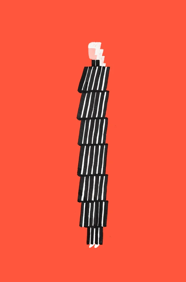
I am obsessed with these book covers. I LOVE the illustration style, the simplicity, and the use of color.
*stands* *claps*


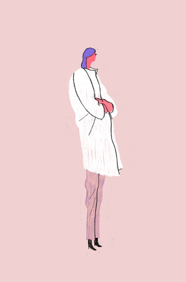
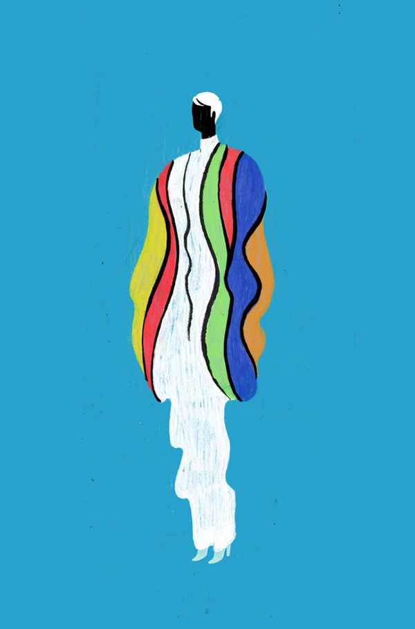
I am obsessed with these book covers. I LOVE the illustration style, the simplicity, and the use of color.
*stands* *claps*


These are stunning. Super simple, elegant, and sharp.
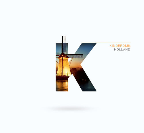
Favorite letters: C, H, O, R

So.my WBFF (work best friend forever) Erin has left our company and moved on to new & exciting adventures. Partly because I love making & writing cards for people, and because I needed a venue to write all of my silly, sappy, thankful, and nostalgic thoughts, I made this card for her.
She is leaving the office world behind and entering the fun world of specialty food, and I could not be happier or more excited (and a tinge jealous) of her.
The top three illustrations are of commonplace items/objects she encountered while here at the office, and the bottom three are just some of the many, many, many exciting items she will be writing about and styling/photographing (not jealous at all, promise ;P ).
I experimented with a new illustration style (for me) - using colored pencils and then adding detail, outlines, and shadow with a Micron pen. I will continue to pursue this style.

Type Exercise: 376
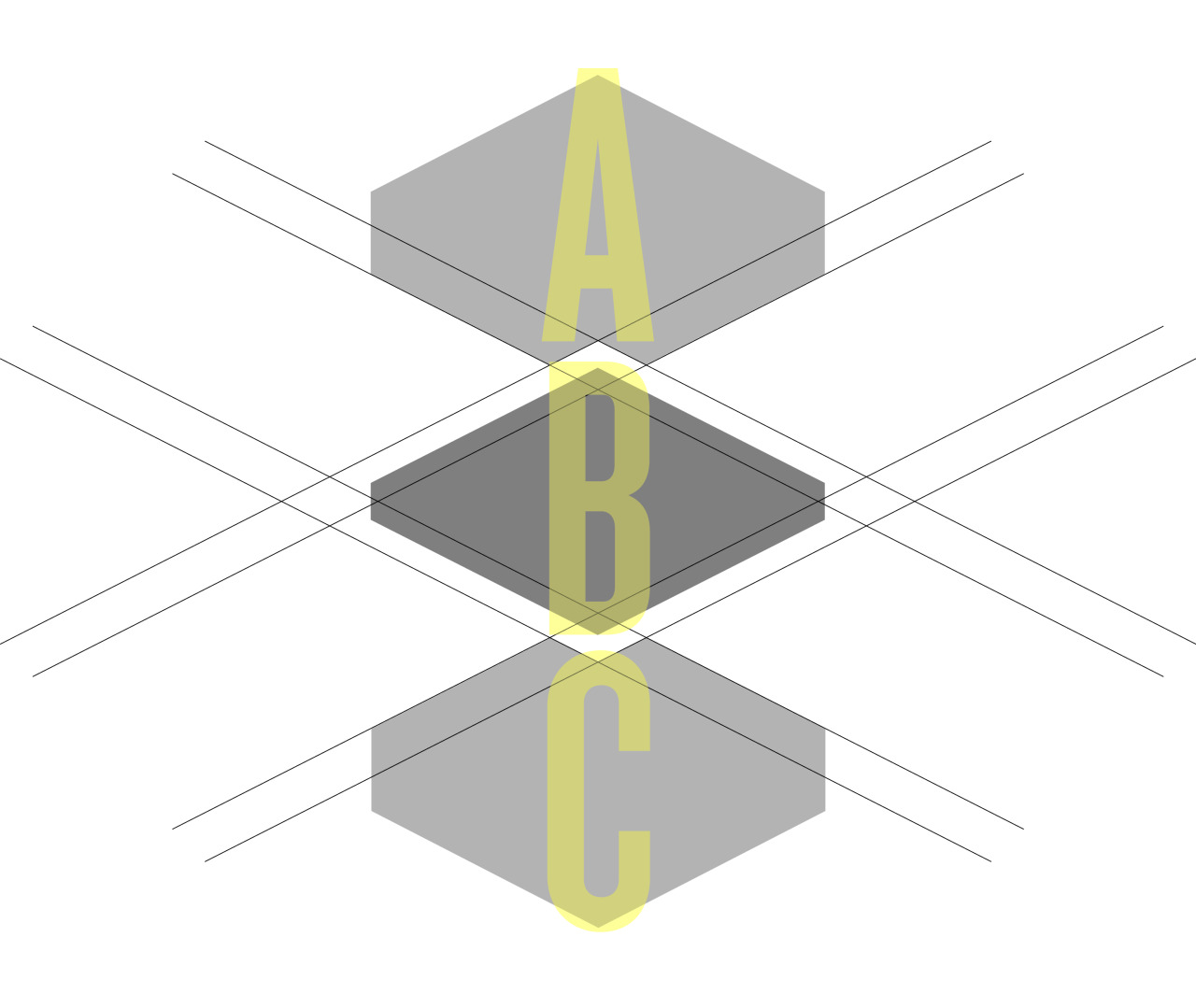
ABC
While working on a logo concept for a project at work, I started playing around with these geometric shapes. I liked their inherent puzzle nature (as they were derived from a compound shape and then broken apart), but I also found their edges and angles intriguing.
This is not perfect, but that’s okay. I am trying to push myself to be more creative and put more work up.
This video shows the process and collection of covers that were designed (and presumably pitched) for the new novel Hausfrau.
I love this! I could have continued to watch for another 10 minutes.
“Chinatown is a Chinese translation of the trademarks in a graphical way.
It’s a carefully arranged series of artworks showcasing 20 well-known western brand logos with maintained visual and narrative continuity.
‘Chinatown’ pushes viewers to ask themselves what it means to see,
hear, and become fully aware. ‘Chinatown’ also demonstrates our strangeness
to 1.35 billion people in the world, when you can’t read Chinese.”
Fascinating. Be sure to click the link above to see more popular logos.


NYC / 1.16.15-1.18.15
I recently spent the weekend in NYC and had the chance to stop by the Museum of Arts & Design. The main exhibit is titled “New Territories”, which is subtitled “Laboratories for Design, Craft and Art in Latin America” - a terrific look into the emerging art world in a variety of Latin American cities.
Above are some highlights, my favorites being the shoe (surrounded by other innovative/weird shoes) and the large-scale 3D typography (made from interlocking postcard sized pieces of ephemera.)
The first photo was the rainy, foggy, gray view from my hotel room Sunday morning.


Best of 2014 (Movie posters / Album covers / Book covers)
Movie posters
Album covers
Book covers

Books I Read in 2014
Goal: 14
Total: 32
Memoirs: 7 (Let’s Pretend This Never Happened, Medium Raw, I Don’t Know What You Know Me From, Heat, Joan Rivers: I Hate Everyone Starting With Me, My Horizontal Life, Not That Kind of Girl)
Books with left-justified type in the upper left corner: 4 (In The Woods, Tenth of December, Not That Kind of Girl, An Object of Beauty)
“Classics”: 6 (The Importance of Being Earnest, The Glass Menagerie, Of Mice and Men, Our Town, The Stranger, Frankenstein)
Books written by authors who aren’t white men: 17 (Let’s Pretend This Never Happened, Dark Places, This Is How You Lose Her, In The Woods, I Don’t Know What You Know Me From, Harry Potter 1-5, Tell The Wolves I’m Home, Joan Rivers: I Hate Everyone Starting With Me, Where’d You Go Bernadette?, My Horizontal Life, Sharp Objects, Not That Kind of Girl, Frankenstein)
Favorites: In The Woods, Mr. Penumbra’s 24 Hour Bookstore, An Object of Beauty
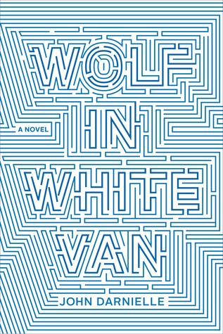
Favorite covers: This Is How You Lose Her, In The Woods, Where’d You Go Bernadette, An Object of Beauty
What are some books you would recommend?
Lacoste - A L!VE pop-up story
This is just too cool. It really demonstrates just how much you can experience within a book. It pushes the senses, the constraints of book design, and takes user experience to a whole new level.
I can’t pick a favorite section/spread!

Paper Critter, v2.0
Unfortunately, I don’t remember exactly what my first Paper Critter looked like, but I was excited to take a stab at it, many years after the first attempt. I took the second opportunity to add in some of my design work, and some of my personal branding to this edition of my paper critter.
I wanted the paper critter to be a mix of myself and my inspiration: color, simplicity, nature, my deer screen print, and geometric shapes.


HOW WE DID IT — SNL TITLE SEQUENCE
Woah. I always love seeing new title sequences (or adjustments to existing ones) - so I was interested to see the revamped style for Season 40 of SNL.
In Alex’s post, he goes through much of the team’s process to create new images and the technology used to do so.
My jaw dropped when I saw how they achieved this… it’s mind-boggling to think about the contraption/calculations needed to create the flashing light mechanism which ends up light-writing the show’s title.
A real treat to peak behind the curtain.
At The New Yorker’s Midtown offices, a wall of covers arranged in chronological order shows a distinct change in tone. Today, the magazine’s covers, which have been drawn or painted by artists each week since its founding in 1925, frequently reflect, or subvert, the news.
The turning point is around Sept. 11, 2001, Mr. Remnick said, when The New Yorker ran a black cover with a black silhouette of the twin towers, by the Pulitzer Prize-winning artist Art Spiegelman, who has long collaborated with his wife and the magazine’s art editor, Françoise Mouly.
A great article about magazine cover design, illustration, and process.
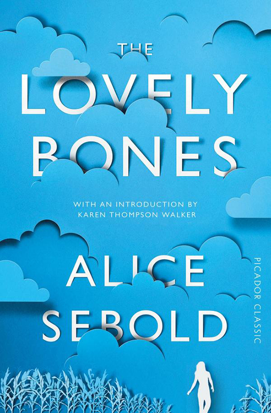
Eiko Ojala
This cover for The Lovely Bones is a fantastic reimagining of the original cover from 12 years ago. I like the continuation of the same general color palette, and think the use of (simulated?) cut paper is extremely effective and playful. While I think the cover would probably work with just the cloud and text, I am happy the designer referenced the main character and a key plot location for the book.
I wonder if the cut paper is simulated or if it was cut by laser…..or even better, by hand!
Type Safari with James Victore
This is really fun and feels very relatable. James and his driver are clearly driving around REAL parts of a city (in this case Brooklyn and Queens) - seeing that wonderful mix of big name brands and smaller outfits, with both beautiful and sometimes unimagined design.
I’d love to do this in Philadelphia. *starts thinking*
Found via The Casual Optimist


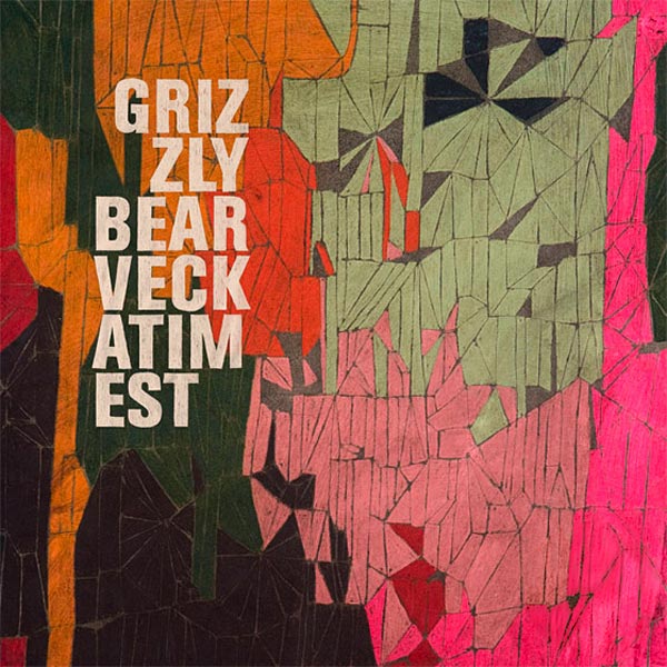


Album Art / CD Cover Designs
In choosing these 10 album covers, I tried to select 10 that would ultimately catch my eye if I saw them in a store or advertised online or in person. Many of the covers feature photography and typography working simultaneously to create one final composition. In these covers, I wanted examples of the typography adding to the cover, and not looking like an afterthought.
With the more experimental and illustrative covers, I tried to select different styles - all which feel very appropriate to the tone/genre of the music. With the Grizzly Bear and the Shins albums in particular, the illustration styles are geometric and experimental. These two album covers also utilize the famous rule-of-thirds.
Björk always manages to produce absolutely vivid, striking, and bizarre covers that often come off looking as if they belong in a high-fashion editorial magazine. For some other examples of her artwork, click here and here.
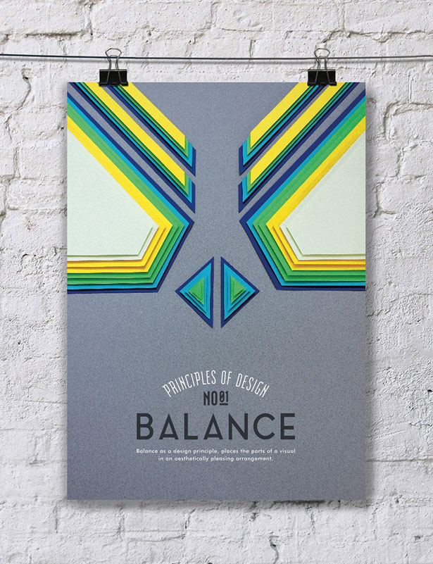


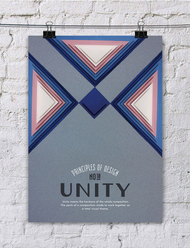


BEAUTIFUL PRINCIPLES OF DESIGN POSTERS.
For a poster series illustrating ten principles of great design, these are - appropriately - beautifully designed. Otherwise it would have been a bit awkward.
Created by Turkish graphic designer Efil Türk using only paper cuttings, these explore the concepts of hierarchy, rhythm, balance, pattern, proportions, space, emphasis, contrast, movement and unity in stunning fashion.
Admire, and learn, below and visit Efil’s Behance page for more great work.
I love these posters so much. The posters are playful and really capture each of the principles. I’m drawn to the cut paper look, and admire Efil’s stunning craft.
My favorite posters are “Pattern” and “Emphasis”.
Susan Kare, Iconographer (EG8)
Terrific presentation by Susan Kare on her icon design career and process. Truly inspiring to see how such memorable and ubiquitous images were created, from concept to use.