Herbie Hickmott

Blog

Best of 2019
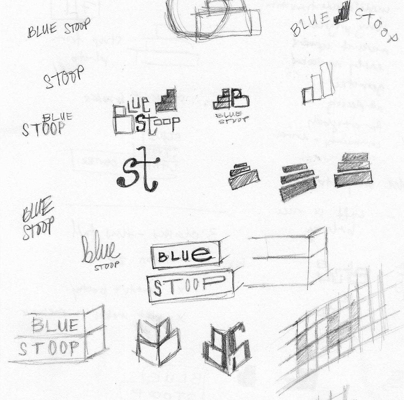
  • When I Get Home by Solange

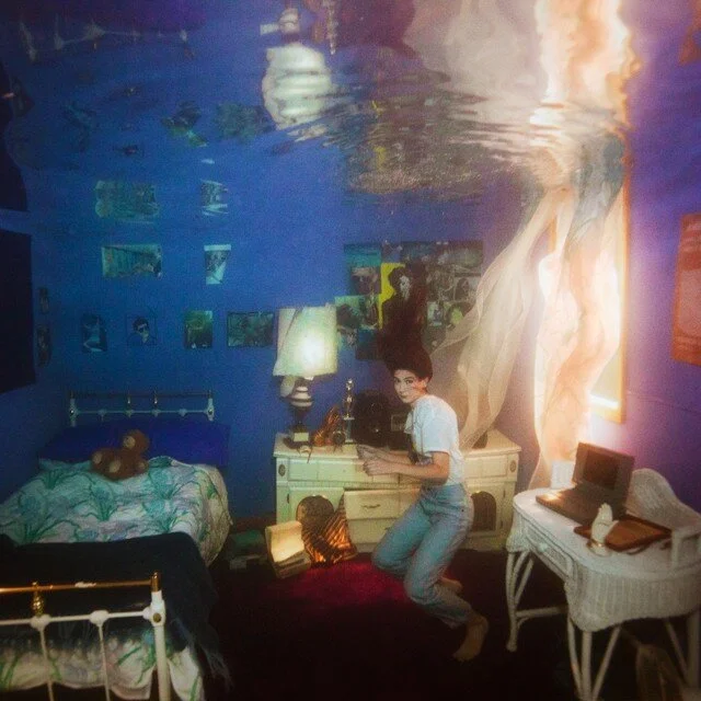
  • Titanic Rising by Weyes Blood

Solange is a master of aesthetics and creating images, performances, and music that are lush with a sleek simplicity and a sense of surprise. Similar in posture to the photograph used on the 2016 album, A Seat at the Table, this cover highlights Solange’s beauty with warmth and tenderness. The accessory, perched on her nose and arched across her eyebrows add a subtle visual interest. 

I appreciate the cheeky nod to the namesake boat in the cover for Weyes Blood’s Titanic Rising. A minimally, but purposefully, decorated bedroom is submerged in water, and there is so much to visually discover as your eye moves around the image. I personally love the blown-out, billowing curtain and the brightness in brings.

  • Frankly in Love by David Yoon (design by Owen Gildersleeve)

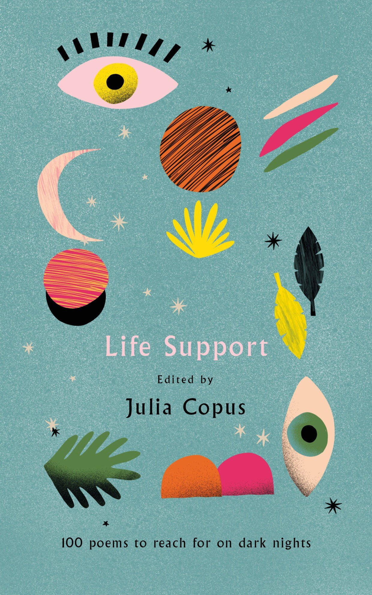
  • Life Support edited by Julia Copus (design by Helen Crawford-White)

  • Mind Fixers by Anne Harrington (design by Matt Dorfman)

What first drew me to these book covers, and keeps me coming back to admire them, is their individual abilities to take common book cover trends and breathe fresh life into them.  Frankly In Love’s unique and stunningly beautiful cut-paper typography is intricate and hints at multiple layers of narrative within the pages. The effect is simple, but the execution is anything but. 

For the collection of poems, Life Support, the designer Helen Crawford-White beautifully assembles irregular and imperfect illustrations, laden with texture and colors seemingly void of a cohesive palette. The composition is beautifully balanced, punctuated with elegant type and the carefully placed illustrations.

Mind Fixers boasts a remarkably simple cover with restrained typography and thin black lines. As the rigid straight lines start to wander and break the grid, the right edge of the composition comes to life, messy with texture and restrained chaos. 

  • Knives Out

  • Midsommar

  • Parasite

The Knives Out poster perfectly captures the knowing nostalgia and mystery at the heart of the film itself. The ultra-stylized image of the ensemble cast is over-saturated, echoing the rich, over-the-top visuals of the movie. The type used for the title is not my favorite, as some letters look awkward or not as considered as others (the ‘K’ and ‘v’ in particular).

I haven’t seen Midsommar, but from what I’ve heard of the film, this poster’s cropped view of a young woman tearfully grimacing feels appropriate. Horror movies so often end up with lackluster or formulaic posters, but I really appreciate the composition and delicate details used here. 

The juxtaposition of the typography in the title for Parasite feels representative of the scrambled genre-bending film itself. Parasite blends straight-forward horror, dark comedy, and thoughtful class critique. The poster hides small easter eggs of information for the viewer to dissect. Even the bars, obscuring the eyes of the actors echoes the distance and divides central to the movie.

Herbie Hickmott
TYPE X BARCELONA

Various examples of typography & signage from our visit to Barcelona in November 2018.

Herbie Hickmott
Sunrise XIV
Sunrise_XIV.png

Late 2018 + early 2019 (Sunrise #14) : Leaving the gym, around 6:30am, looking east on Market Street. (L to R: 12/11/18; 12/12/18; 12/13/18; 12/14/18; 12/17/18; 12/18/18; 12/19/18; 12/20/18; 12/21/18; 1/7/19; 1/8/19; 1/9/19)

Herbie Hickmott
18 for 2018
18x18.png

In early 2018, I made a list of 18 personal goals I’d like to try to accomplish during 2018. Here are some that had accompanying photos 🤩

Herbie Hickmott
Sunrise XIII
Sunrise_XIII.png

Back in the swing of things (Sunrise #13) : Leaving the gym, around 6:45am, looking east on Market Street. (L to R: 11/5/18; 11/6/18; 11/9/18; 11/26/18; 11/27/18; 11/28/18; 11/30/18; 12/3/18; 12/4/18; 12/5/18; 12/7/18; 12/10/18)

Herbie Hickmott
TYPE X PARIS

Out + About

These examples of typography were gathered from our wanderings around Paris. I loved how expressive, refined, and interesting they were. The mix of classic styles with newer trends (that mono-weight interlocking first pic!) fascinated me.


Inside Palais Garnier

One of our favorite stops in Paris was Palais Garnier, an absolutely stunning Opera house from the mid-19th Century. The architecture, ornate details (probably to be featured in another post), and many examples of typography throughout the building was something truly special.

Herbie Hickmott
Best of 2018

Album Covers

It’s not unusual to see a performer’s face or image on the cover of their album – but seeing the exquisitely stylized and icon-like image of Janelle Monae’s Dirty Computer has resonated with me throughout the year. I am drawn to the visual texture in the image, the funky and strange typography, and the blend of warm, cool, and metallic hues.

Young Thug’s album/mixtape Slime Language showcases an interesting idea - rethinking representations of letters through sign language. The ASL paired with the harsh splatter of paint creates an interesting and somewhat arresting juxtaposition.

Book Covers

What draws me to all four of these book covers is their attention to detail and their overarching concept. The execution here is spot on - from the integration of numbers reading as text in Bitwise; or the riff on seeing a holy image in your toast in Heretics Anonymous; the little cues that tell you everything you need to know about The Library Book; or the brash and funny photograph at the center of Pretend I’m Dead. (Reviewing some of the book covers released each year is one of my favorite parts of the year!)

Film Posters

I really like the direct, in-your-face, awkwardness of the Eighth Grade poster. The main character’s image takes up about half of the poster, but is obstructed by her hand/cell phone and large type, which creates visual layers, ultimately hiding her. It is reminiscent of the film itself - endearing, honest, and sometimes a bit awkward.

The Chappaquiddick poster is incredibly successful in it’s simplicity and it’s ability to layer concept, execution, and composition. The over-the-top nod to the American flag paired with the image of sinking car in blue water is a perfect map. The no-frills typography feels nostalgic for the time period, too.

Herbie Hickmott
Sunrise XII
Sunrise_XII.png

(S)POOPY (Sunrise #12) : Leaving the gym, around 6:45am, looking east on Market Street. (L to R: 10/10/18; 10/12/18; 10/15/18; 10/16/18; 10/17/18; 10/22/18; 10/23/18; 10/26/18; 10/29/18l 10/30/18; 10/31/18; 11/1/18)

Herbie Hickmott
Blitz
Blitz_Animation.gif

I was in a meeting at work (about a ‘marketing blitz’ - hoping to get residents in a specific neighborhood in Philadelphia to sign up for a program) and doodled the word ‘blitz’ in my notebook.

Blitz_Original.gif

I don’t do a ton of hand-rendered type in Illustrator, but this felt like a nice challenge.

My vector-ized attempt is below:

Blitz_AI.png
Herbie Hickmott
Sunrise XI
Sunrise_XI.png

😑 not feelin’ it lately & not feelin’ these colors (Sunrise #11) : Leaving the gym, around 6:45am, looking east on Market Street. (L to R: 9/20/18; 9/21/18; 9/24/18; 9/25/18; 9/26/18; 9/28/18; 10/1/18; 10/2/18; 10/3/18; 10/5/18; 10/8/18; 10/9/18)

Herbie Hickmott
Sunrise X
Sunrise_X.png

Late summer (Sunrise #10) : Leaving the gym, around 6:45am, looking east on Market Street. (L to R: 9/4/18; 9/5/18; 9/6/18; 9/7/18; 9/10/18; 9/11/18; 9/12/18; 9/13/18; 9/14/18; 9/17/18; 9/18/18; 9/19/18)

Herbie Hickmott
Sunrise IX
Sunrise_IX.png

August mornings (Sunrise #9) : Leaving the gym, around 6:45am, looking east on Market Street. (L to R: 8/18/18; 8/9/18; 8/10/18; 8/14/18; 8/15/18; 8/16/18; 8/17/18; 8/27/18; 8/28/18; 8/29/18; 8/30/18; 8/31/18)

Herbie Hickmott
Blue Stoop (Logo Process)

Blue Stoop: Or, how Philly's new literary hub (inspired by a poem, inspired by a photo of a stoop) came to be.

When my close friend, Joshua Demaree, mentioned he had a project he wanted to talk to me about, it was an offhand comment. Quickly, on his way out of my apartment, he breezily noted "Oh, I have a possible design thing I want to chat with you about soon..."

Cut to: a few weeks later, and meeting with Joshua and Emma Eisenberg (Blue Stoop co-creator, fellow Philly-based writer & all-around cool person) hearing about their vision for Blue Stoop, Philadelphia's new literary hub.

They wanted a logo – something that represented a sense of community, meeting space, inspiration, and that would feel at home amongst other literary hubs in the nation (The Porch; The Loft; Grubstreet, etc.)


I started with getting my thoughts out on paper: frantically jotting down words, phrases, and notes from my conversation with Joshua & Emma. As I wrote out words, I also was thinking through some visual ideas - some of the obvious, first-thought things that immediately bubble to the surface and need to escape. 

Here are some of those first sketches:


When I turned to the computer and started my next process of translating sketches to digital sketches and working through initial thoughts on screen, I was finding I had plenty of ideas, but how many were viable options that I could present to Joshua & Emma for review?

1_Logos_1.png

I took a few days away from the project and came back with a clearer vision for the mark. I was happy with two concepts, but struggled to find a third – until I tried something unrelated to the stoop entirely and found my third concept in about 30 seconds (far right, below.)


1_Logos_2.png

Something I've learned is how important context is. How does a design translate to the real world? Even if the logos I was pitching worked nicely on screen, they would eventually need to be turned into a shirt, or notebook, or tote bag as a gift to donors.

1_Logos_3.png

To be honest, my favorite part of the whole project (and development process) was mocking the potential logos up on canvas totes. I found a great mockup, from GraphicBurger, and put it to good use. 


Joshua & Emma responded positively to my three marks, and immediately liked components of all three concepts. They shared some helpful feedback and guidance, which led me to some more retooling, sketching, and development.

1_Logos_4.png
1_Logos_5.png

Again, Joshua & Emma were happy with all three proposals, but were immediately drawn to the third mark. Before I knew it (and had even shared final files) the logo was popping up on Blue Stoop's various web accounts and it was live.

1_Logos_6.png

Since we first met in late June 2018, Joshua & Emma have received a ton of press and buzz (Philadelphia Weekly; The Inquirer; UC Review, etc.) and are launching their first series of coursework this fall.

It's all very exciting :)

www.bluestoop.org / @bluestoopphl (Twitter) / @bluestoopphl (Instagram)

Herbie Hickmott
Sunrise VIII
Sunrise_VIII.png

Keeping it 💯 with my 100th visit to the gym in 2018 (Sunrise #8) : Leaving the gym, around 6:45am, looking east on Market Street. (L to R: 7/19/18; 7/20/18; 7/23/18; 7/24/18; 7/25/18; 7/26/18; 7/30/18; 8/1/18; 8/2/18; 8/3/18; 8/6/18; 8/17/18)

Herbie Hickmott
PWD Friday Studio (Counter-less typography)

Every few Fridays, the incredible team of talented folks I get to work with like to get away from our desks and screens and focus on some hand-done mini-projects. 

A recent "Friday studio" pulled inspiration from Sketching Type: A Guided Sketchbook for Creative Hand Lettering by Lee Suttey and an exercise on 'counterless type' or creating letters without the counter ('inner or enclosed space' of a letter, like the enclosed space in an 'o' or 'B').

These are some of the counterless letters I sketched out:

Counterless_Type.jpg
Herbie Hickmott
PWD Friday Studio (Collage)

Every few Fridays, the incredible team of talented folks I get to work with like to get away from our desks and screens and focus on some hand-done mini-projects. 

A recent "Friday studio" focused on collaging old, soon-to-be recycled paper products (out-of-date drinking water quality reports, old advertisements, various outdated outreach material, and some beautiful Communication Arts magazines from the 1960s.)

I immediately covered most of my 7" x 7" square with a swash of PWD blue (the back of a report from 2015.) From there, I was drawn to the old and beautiful relics of past design (that illustration style! the typography! the halftones!)

I ended up really liking the asymmetry of the collage, and leaned into the misogynistic/sexist undertones found in some of the source material (lookin' at you, 1960s Communication Arts...) 

Collage_Encore-Facts-2018.jpg
Herbie Hickmott
Sunrise VII

Some fine summer sunrises 😎 (Sunrise #7) : Leaving the gym, around 6:45am, looking east on Market Street. (L to R: 6/29/18; 7/2/18; 7/3/18; 7/6/18; 7/9/18; 7/10/18; 7/11/18; 7/12/18; 7/13/18; 7/16/18; 7/17/18; 7/18/18)

Herbie Hickmott
Snail Mail "Pristine"

I heard "Pristine", the lead single from Snail Mail's debut album, Lush, on an episode of NPR's All Songs Considered and was instantly struck by the lyrics. The honesty and ripe emotion in Lindsay Jordan/s (who is... 19!?) writing is stunning.

It feels appropriate for being 19, or 14, or 22, or 27. 

Don't you like me for me?
Is there any better feeling than coming clean?
And I know myself and I'll never love anyone else
I won't love anyone else
I'll never love anyone else
If it's not supposed to be
Then I'll just let it be
And out of everyone
Be honest with me
Who do you change for?
Who's top of your world?
And out of everyone
Who's your type of girl?

It's obvious that I'm finding inspiration in the clouds and how the sky changes during the day, month, and year (see Sunrise posts.) The background photo was taken in late June at 2nd & Washington in South Philadelphia (flipped vertically.) The photo/texture from the text is a mistake that was captured via iPhone camera (you know when you accidentally take a picture out of focus, in motion, or of nothing? Yes, that.)

So, find inspiration anywhere and everywhere. Cherish what speaks to you.


Herbie Hickmott
SUNRISE VI
Sunrise_VI.png

See ya, June 👋🏼 (Sunrise #6) : Leaving the gym, around 6:45am, looking east on Market Street. (L to R: 6/11/18; 6/12/18; 6/13/18; 6/14/18; 6/15/18; 6/18/18; 6/19/18; 6/20/18; 6/25/18; 6/26/18; 6/27/18; 6/28/18)

Herbie Hickmott