Blog

Posts tagged design
tumblr_nvee6o2UYd1rxtp97o1_1280.jpg
tumblr_nvee6o2UYd1rxtp97o2_1280.jpg
tumblr_nvee6o2UYd1rxtp97o3_1280.jpg
tumblr_nvee6o2UYd1rxtp97o4_1280.jpg
tumblr_nvee6o2UYd1rxtp97o5_1280.jpg
tumblr_nvee6o2UYd1rxtp97o8_1280.jpg
tumblr_nvee6o2UYd1rxtp97o6_1280.jpg
tumblr_nvee6o2UYd1rxtp97o7_1280.jpg
tumblr_nvee6o2UYd1rxtp97o9_1280.jpg

Chicago | August 2015

I visited Chicago for a long weekend in late August 2015 and absolutely fell in love with it’s architecture, people, food, and overall accessibility. 

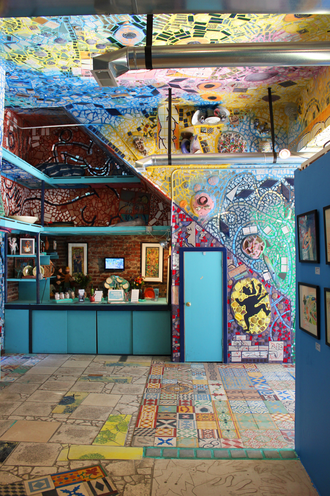
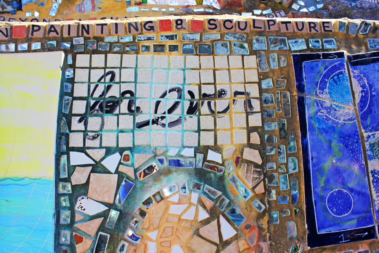
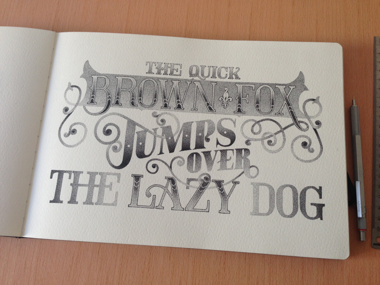
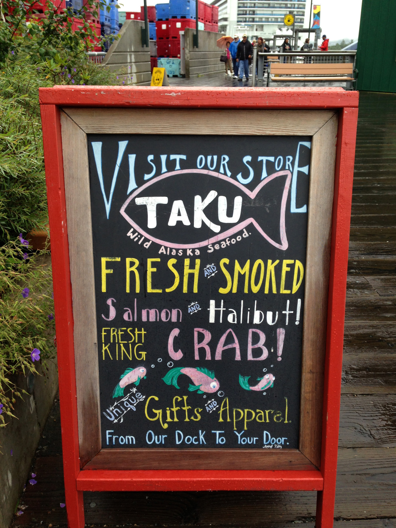
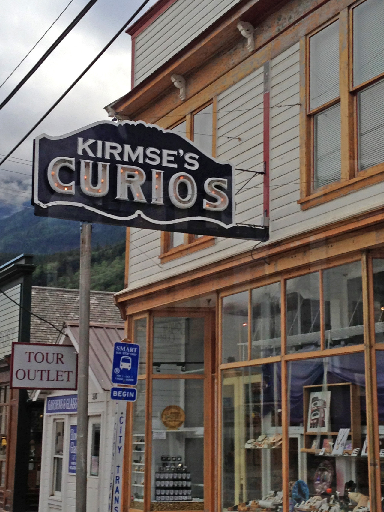
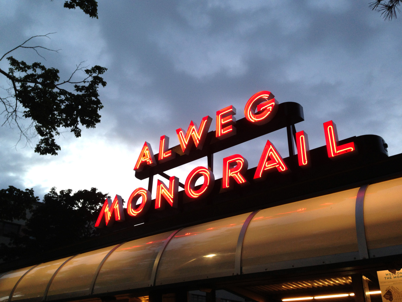
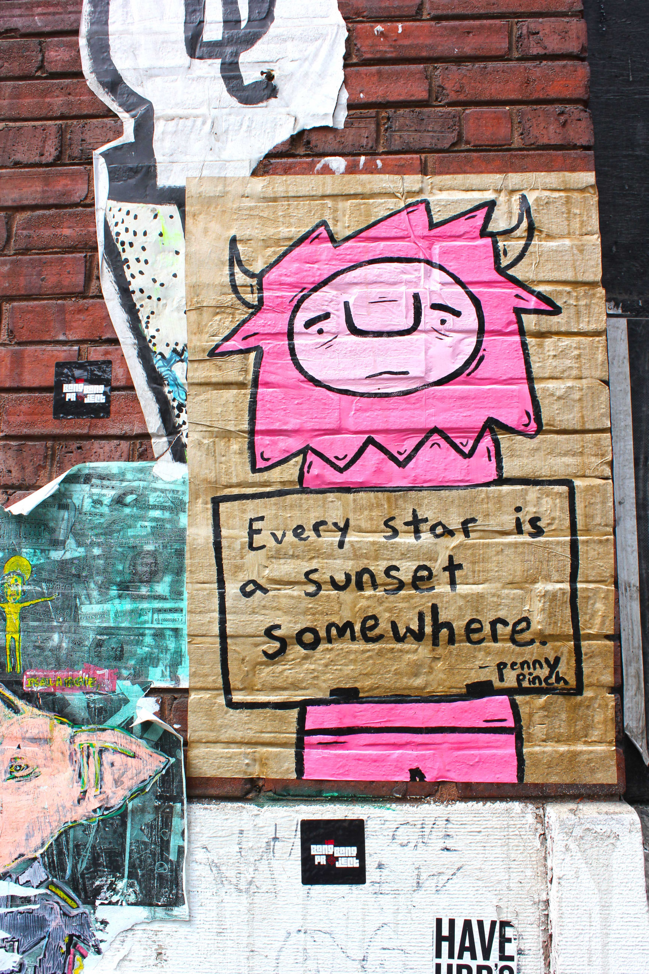
Here are some of my favorite shots from the trip! It’s an odd mix of everything I admired about Chicago: the eclectic mix of architecture, art & design styles; the inventive food; the welcoming people; and the beauty of the city at large.

tumblr_nq1ze4f9ca1rxtp97o1_1280.jpg
tumblr_nq1ze4f9ca1rxtp97o2_1280.jpg

I was waiting in line at Starbucks last week and these stunning information cards caught my eye. Super funky patterns and foil stamping 👀👀👀.

They are information cards about a limited-run of Starbucks Reserve coffee, featuring coffee from around the world. There are six in total, each one completely different, unique, and reflective of the location. 

My favorite (of these three) is the Brazil one. i enjoy the geometric elements and the overall simplicity of the card. 

tumblr_nhk1u4BaFm1rxtp97o2_1280.jpg
tumblr_nhk1u4BaFm1rxtp97o3_1280.jpg
tumblr_nhk1u4BaFm1rxtp97o9_1280.jpg
tumblr_nhk1u4BaFm1rxtp97o4_1280.jpg
tumblr_nhk1u4BaFm1rxtp97o1_400.jpg
tumblr_nhk1u4BaFm1rxtp97o6_1280.jpg
tumblr_nhk1u4BaFm1rxtp97o7_400.jpg
tumblr_nhk1u4BaFm1rxtp97o8_1280.jpg
tumblr_nhk1u4BaFm1rxtp97o5_1280.jpg

Best of 2014 (Movie posters / Album covers / Book covers)

Movie posters

  • Gone Girl: One of my most anticipated movies of 2014 was David Fincher’s adaption of Gillian Flynn’s thriller “Gone Girl”. As posters and production stills started being released, posters like this one not only spoke to Fincher’s signature style, but also a visual adaption of Flynn’s mysterious and haunting book. The cheeky/clever use of the text and it’s meaning work incredibly well as a teaser for the film. 
  • Inherent Vice: As of this post, I have not seen Inherent Vice, but the poster immediately grabbed my attention. The poster feels both referential of earlier decades and completely new and fresh. The design is playful, and the typography is elegant and purposeful. The composition is somewhat expected, but all of the pieces come together to create a memorable poster. 
  • The Hunger Games: Mockingjay Part 1: The Hunger Games movie franchise has always had some incredible creative direction and marketing rollout. While this isn’t the full movie poster, this teaser photograph/poster conveys so much interest and mystery in one image. The all-white photograph is haunting and makes the subjects look both statuesque and futuristic. 

Album covers

  • St. Vincent, St. VincentI’ve written about this album cover before here, but it’s still one of my favorites from the year (and one of my favorite albums.) St. Vincent’s bright, rich, and enigmatic sound is replicated with a simple, stirring, and (fake) minimalistic-inspired cover. The typography is weird and geometric, her pose is regal and elegant, and the severe contrast of colors work to make the cover visually stunning.
  • FKA twigs, LP1There’s something so unique, moving, and subtle about FKA twigs’ music, and this cover helps to communicate all of those things. Photographed and manipulated by artist Jesse Kanda, the bright, stirring, surreal cover is one that I think will be continually regarded as an important and “classic” album cover.
  • Tycho, Awake:  This minimalistic and restrained album cover is elegant in it’s simplicity. The range of colors and geometry convey the ambient and calming music that Tycho releases. 

Book covers

  • Wolf In White Van by John Darnielle: While almost headache-inducing, this weird, challenging, and maze of a book cover is really eye-catching. The two-color cover evokes a sense of mystery, curiosity, and confusion - all while being visually appealing and well-designed.
  • Your Face in Mine by Jess Row: I love this book cover for it’s simplicity, character, and elegance in it’s geometry. The abstracted geometric shapes come together to form an interesting shape (I see a geometric interpretation of an ampersand.) I particularly enjoy the change in typeface for the word “in” - it’s simple and almost goes by without notice, but everything comes together to form a simple, geometric, and pleasing cover.
  • The Silent History by Eli Horowitz, Kevin Moffett, Matthew Derby: This cover utilizes a clever typographic solution - a combination of geometric letters and blank spaces, with hand-written text set inside. The book is about a new generation of children who are born unable to understand language. It’s a dense topic, but the cover is deceptively simple and features some mystery in the combination of the set/written text. 
tumblr_ne2yg7CE0J1rxtp97o1_1280.jpg
tumblr_ne2yg7CE0J1rxtp97o5_1280.jpg
tumblr_ne2yg7CE0J1rxtp97o2_1280.jpg
tumblr_ne2yg7CE0J1rxtp97o3_1280.jpg
tumblr_ne2yg7CE0J1rxtp97o4_1280.jpg
tumblr_ne2yg7CE0J1rxtp97o8_1280.jpg
tumblr_ne2yg7CE0J1rxtp97o6_1280.jpg
tumblr_ne2yg7CE0J1rxtp97o7_1280.jpg

Philadelphia’s Magic Gardens

Over the weekend, I finally had the chance to visit Isaiah Zagar’s sprawling artistic wonderland, tucked away along South Street. I have known about Zagar’s work for a while now, and have seen it on buildings, in stairwells, and out in the open in the rest of the city - but never visited the Magic Gardens themselves until Saturday.

You could spend hours (days, really) scoping out all of the hidden parts of the space.  We spent some time exploring inside, then spent the majority of the time outside, working our way through the labyrinth of tunnels, caves, walkways, and gardens. 

Philadelphia’s Magic Gardens | 1020 South Street, Philadelphia PA 19147 | http://www.phillymagicgardens.org/

tumblr_ndr2dlBHHE1rxtp97o1_400.gif
tumblr_ndr2dlBHHE1rxtp97o2_1280.gif
tumblr_ndr2dlBHHE1rxtp97o3_1280.jpg

HOW WE DID IT — SNL TITLE SEQUENCE

Woah.  I always love seeing new title sequences (or adjustments to existing ones) - so I was interested to see the revamped style for Season 40 of SNL.

In Alex’s post, he goes through much of the team’s process to create new images and the technology used to do so.

My jaw dropped when I saw how they achieved this… it’s mind-boggling to think about the contraption/calculations needed to create the flashing light mechanism which ends up light-writing the show’s title.

A real treat to peak behind the curtain.

bookcovrs:

Eiko Ojala

This cover for The Lovely Bones is a fantastic reimagining of the original cover from 12 years ago. I like the continuation of the same general color palette, and think the use of (simulated?) cut paper is extremely effective…

bookcovrs:

Eiko Ojala

This cover for The Lovely Bones is a fantastic reimagining of the original cover from 12 years ago. I like the continuation of the same general color palette, and think the use of (simulated?) cut paper is extremely effective and playful.  While I think the cover would probably work with just the cloud and text, I am happy the designer referenced the main character and a key plot location for the book.

I wonder if the cut paper is simulated or if it was cut by laser…..or even better, by hand!

Type Safari with James Victore

This is really fun and feels very relatable.  James and his driver are clearly driving around REAL parts of a city (in this case Brooklyn and Queens) - seeing that wonderful mix of big name brands and smaller outfits, with both beautiful and sometimes unimagined design.  

I’d love to do this in Philadelphia. *starts thinking*

Found via The Casual Optimist

tumblr_naarzkpvB11rqkmfko1_1280.jpg
tumblr_naarzkpvB11rqkmfko3_1280.jpg
tumblr_naarzkpvB11rqkmfko4_1280.jpg
tumblr_naarzkpvB11rqkmfko10_1280.jpg
tumblr_naarzkpvB11rqkmfko7_1280.jpg
tumblr_naarzkpvB11rqkmfko8_1280.jpg
tumblr_naarzkpvB11rqkmfko9_1280.jpg

lamski:

BEAUTIFUL PRINCIPLES OF DESIGN POSTERS.

For a poster series illustrating ten principles of great design, these are - appropriately - beautifully designed. Otherwise it would have been a bit awkward.

Created by Turkish graphic designer Efil Türk using only paper cuttings, these explore the concepts of hierarchy, rhythm, balance, pattern, proportions, space, emphasis, contrast, movement and unity in stunning fashion.

Admire, and learn, below and visit Efil’s Behance page for more great work.

I love these posters so much.  The posters are playful and really capture each of the principles.  I’m drawn to the cut paper look, and admire Efil’s stunning craft. 

My favorite posters are “Pattern” and “Emphasis”. 

tumblr_n18o3cCcw31s42u81o8_1280.jpg
tumblr_n18o3cCcw31s42u81o3_1280.jpg
tumblr_n18o3cCcw31s42u81o5_1280.jpg
tumblr_n18o3cCcw31s42u81o4_1280.jpg
tumblr_n18o3cCcw31s42u81o2_1280.jpg
tumblr_n18o3cCcw31s42u81o10_1280.jpg
tumblr_n18o3cCcw31s42u81o7_1280.jpg
tumblr_n18o3cCcw31s42u81o6_1280.jpg
tumblr_n18o3cCcw31s42u81o9_1280.jpg
tumblr_n18o3cCcw31s42u81o1_1280.jpg

casaltaxavier:

The entire collection of “The quick brown fox jumps over the lazy dog” made with 0.10mm - 0.35mm - 0.70mm dots.

This collection was made for a workshop and a conference that I held in the University of Wisconsin Stevens Point during the NowHere conference, an annual event organized by the UWSP-AIGA chapter.

More  details on Behance

Limited edition prints are available - Store

Casalta Xavier
Facebook | Tumblr | Instagram

I am blown away at this.  If I am ever 5% as talented, patient, and dedicated as Casalta Xavier…

tumblr_mwvrgx0R9N1rxtp97o3_1280.jpg
tumblr_mwvrgx0R9N1rxtp97o1_1280.jpg
tumblr_mwvrgx0R9N1rxtp97o2_1280.jpg
tumblr_mwvrgx0R9N1rxtp97o4_1280.jpg
tumblr_mwvrgx0R9N1rxtp97o5_1280.jpg
tumblr_mwvrgx0R9N1rxtp97o7_1280.jpg
tumblr_mwvrgx0R9N1rxtp97o10_1280.jpg
tumblr_mwvrgx0R9N1rxtp97o6_1280.jpg
tumblr_mwvrgx0R9N1rxtp97o9_1280.jpg
tumblr_mwvrgx0R9N1rxtp97o8_1280.jpg

Typography | Pacific Northwest (Seattle, Juneau, Skagway. the Yukon)

I’m (finally….) getting around to editing/organizing my pictures from my trip with my family back in August 2013 to Seattle + Alaska.  

More photos to come.
(All photos shot with iPhone 5 and edited in Photoshop CS6.)

© Herbie Hickmott 2013