Eiko Ojala
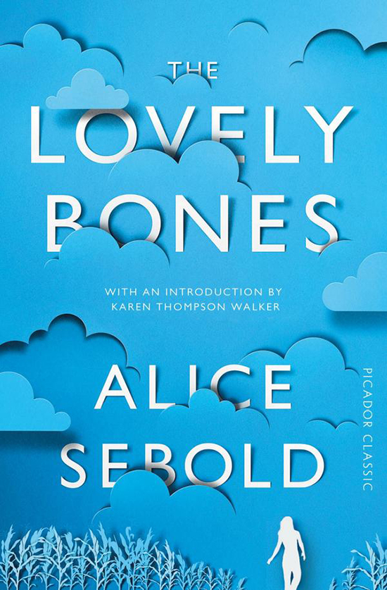
This cover for The Lovely Bones is a fantastic reimagining of the original cover from 12 years ago. I like the continuation of the same general color palette, and think the use of (simulated?) cut paper is extremely effective and playful. While I think the cover would probably work with just the cloud and text, I am happy the designer referenced the main character and a key plot location for the book.
I wonder if the cut paper is simulated or if it was cut by laser…..or even better, by hand!