
Blue Stoop (Logo Process)

Blue Stoop: Or, how Philly's new literary hub (inspired by a poem, inspired by a photo of a stoop) came to be.
When my close friend, Joshua Demaree, mentioned he had a project he wanted to talk to me about, it was an offhand comment. Quickly, on his way out of my apartment, he breezily noted "Oh, I have a possible design thing I want to chat with you about soon..."
Cut to: a few weeks later, and meeting with Joshua and Emma Eisenberg (Blue Stoop co-creator, fellow Philly-based writer & all-around cool person) hearing about their vision for Blue Stoop, Philadelphia's new literary hub.
They wanted a logo – something that represented a sense of community, meeting space, inspiration, and that would feel at home amongst other literary hubs in the nation (The Porch; The Loft; Grubstreet, etc.)
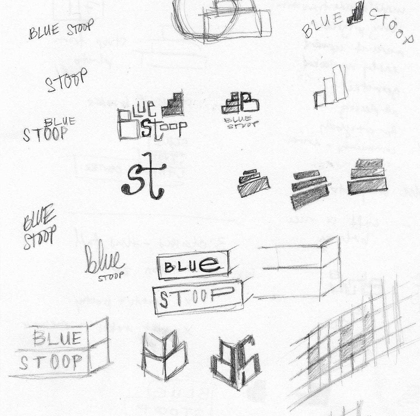
I started with getting my thoughts out on paper: frantically jotting down words, phrases, and notes from my conversation with Joshua & Emma. As I wrote out words, I also was thinking through some visual ideas - some of the obvious, first-thought things that immediately bubble to the surface and need to escape.
Here are some of those first sketches:

When I turned to the computer and started my next process of translating sketches to digital sketches and working through initial thoughts on screen, I was finding I had plenty of ideas, but how many were viable options that I could present to Joshua & Emma for review?
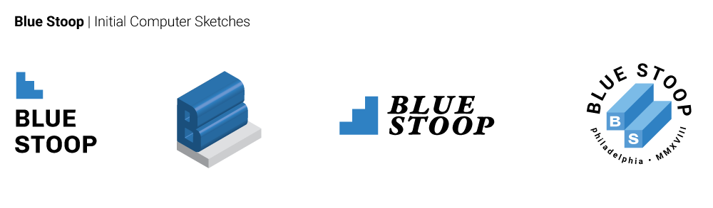
I took a few days away from the project and came back with a clearer vision for the mark. I was happy with two concepts, but struggled to find a third – until I tried something unrelated to the stoop entirely and found my third concept in about 30 seconds (far right, below.)

Something I've learned is how important context is. How does a design translate to the real world? Even if the logos I was pitching worked nicely on screen, they would eventually need to be turned into a shirt, or notebook, or tote bag as a gift to donors.
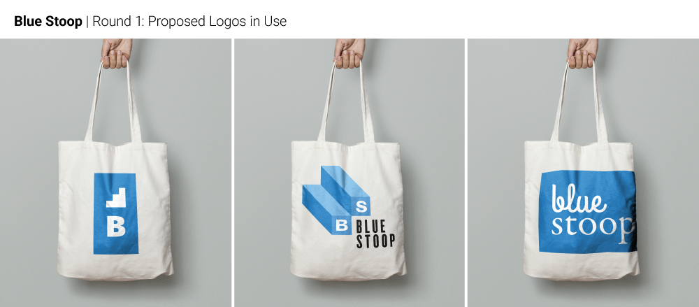
To be honest, my favorite part of the whole project (and development process) was mocking the potential logos up on canvas totes. I found a great mockup, from GraphicBurger, and put it to good use.
Joshua & Emma responded positively to my three marks, and immediately liked components of all three concepts. They shared some helpful feedback and guidance, which led me to some more retooling, sketching, and development.
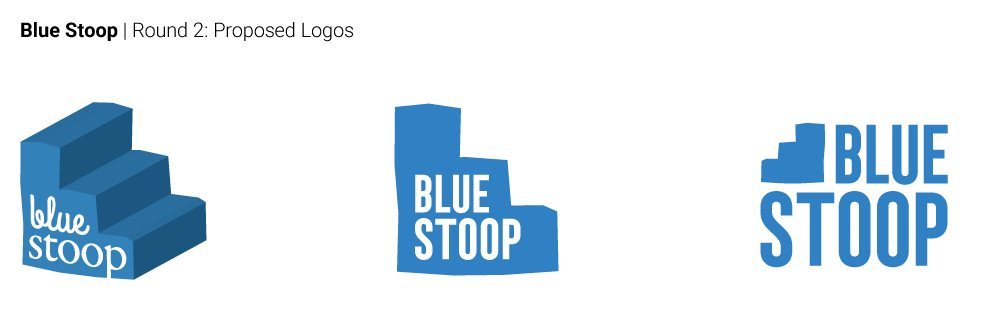

Again, Joshua & Emma were happy with all three proposals, but were immediately drawn to the third mark. Before I knew it (and had even shared final files) the logo was popping up on Blue Stoop's various web accounts and it was live.

Since we first met in late June 2018, Joshua & Emma have received a ton of press and buzz (Philadelphia Weekly; The Inquirer; UC Review, etc.) and are launching their first series of coursework this fall.
It's all very exciting :)
www.bluestoop.org / @bluestoopphl (Twitter) / @bluestoopphl (Instagram)