


Year in Cover/Poster Design 2012
Book Covers
- Angelmaker by Nick Harkaway [cover design Jason Booher]
I think the most striking thing about this cover is the fact that I’m not really sure what is going on. It’s undoubtedly a busy cover, with a number of contrasting elements all working to create something that is puzzling, but still visually striking. I think the use of typography (both placed and integrated into the cover) work to the cover’s benefit, and whatever those geometric/gridded circles are keep me focused on the cover. - The Forsaken by Lisa M. Stasse [cover design Hilary Zarycky]
Admittedly, one of my design weaknesses is profile views of people that feature disintegration or layered images to make up the shape of the face/head. The altered typography frames the face nicely and adds enough color to accent the design without overpowering it. - This Is How You Lose Her by Junot Diaz [cover design - will update when I find]
To start my explanation, I must say that I am a huge fan of Junot Diaz. The cover for his book The Brief Wondrous Life of Oscar Wao caught my attention in the store and when I read the novel, I was just as pleased. I appreciate the visual continuity between the two novels. Simple typography, striking imagery, and enough visual information to reel you in, but not enough to tell you much beyond the title. I don’t think this style could work for many other authors/books, but Diaz’s ultra-colorful prose is strong enough to hold up to this stark and understated approach.
Movie Posters
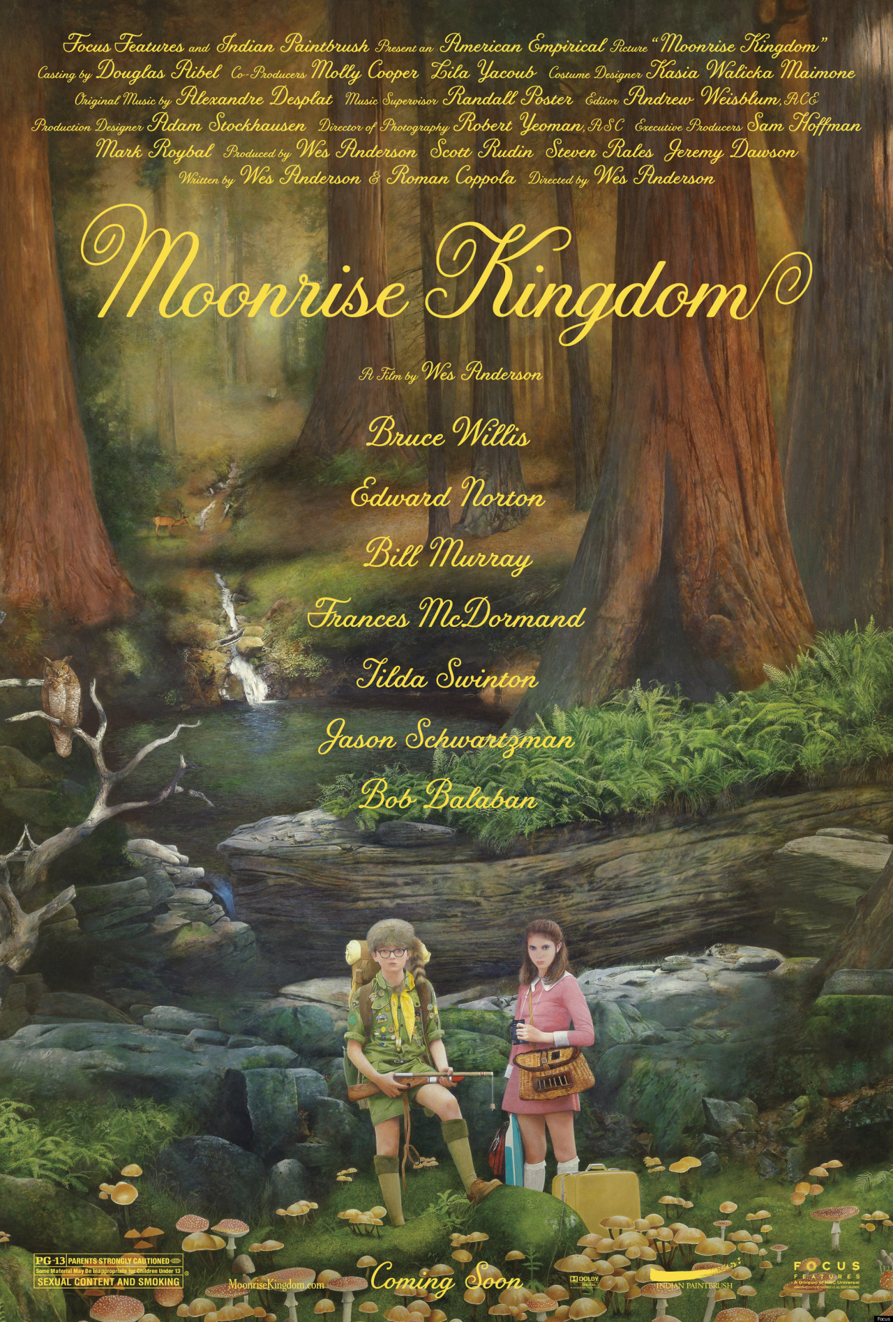
- Moonrise Kingdom [d. Wes Anderson]
Delicate, touching, and colorful - three adjectives that describe this poster/any postre for a Wes Anderson film/any of Wes Anderson’s films. This poster relies on a straight-forward illustration accompanied by a quirky script face that works better in some places than others (a display face might work better for the actual title, but no one asked me.) All in all, I like the illustration style and find the whole thing quite charming. - Paranorman [d. Chris Butler, Sam Fell]
I know this was not the wide-release poster and may very well be a fan-made poster, but it’s both quite striking and very fun. It has a lot of character (literally) and a child-like playfulness that is often lost to feature every other aspect from the movie. Each letter creates a scene that is unique and special in it’s own way. - The Sessions [d. Ben Lewin]
Again, this was not the wide-release poster (I actually think that one is kind of ugly…) but this poster more accurately captures the heart, spirit, and intimate nature of the film itself (side note: one of the best films of the year, see it.) The hand-drawn approach mirrors the hands-on/human touch theme that is felt throughout the entire film. This poster is beautiful and acts as a perfect companion to the film. - Wreck It Ralph [d. Rich Moore]
Simple, smart, and designed a wink (again, here I’m describing both the poster and the film itself.) There isn’t much to say besides the simplicity of the poster aids in how eye-catching and striking the poster is. What could have been an over-wrought computer-generated mess is instead an all-knowing wink to the glorious pixel.
So that’s that. It’s no surprise that I am drawn to the more illustrative/simple designs. These aren’t at all what I thought were the best in terms of quality books or movies of the year, simply from a design standpoint (although both The Sessions and Wreck It Ralph would be in my top films of the year.)