Herbie Hickmott

Blog

2016 Books: A–Z

Chris suggested late in 2015 that I challenge myself to read a book starting with every letter of the alphabet in 2016 (eliminating some small article words, like 'the' 'a' etc). I wanted to try some new authors, topics, points of views, and types of books in the process. I did not read the books in any order - just kind of started somewhere and found my way through the alphabet.

Some favorites/thoughts:

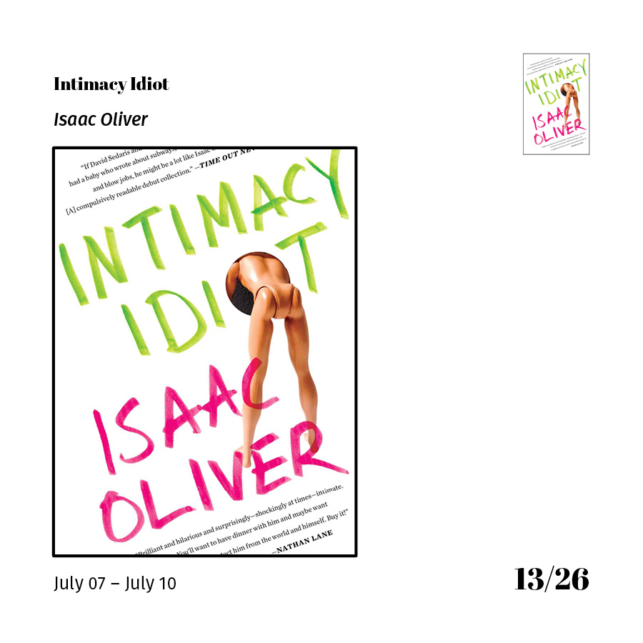
  • Favorite Overall Read: Intimacy Idiot by Isaac Oliver
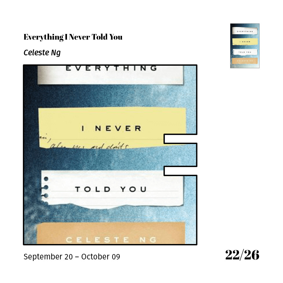
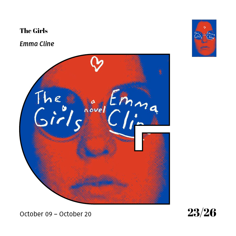
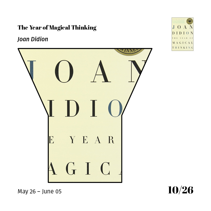
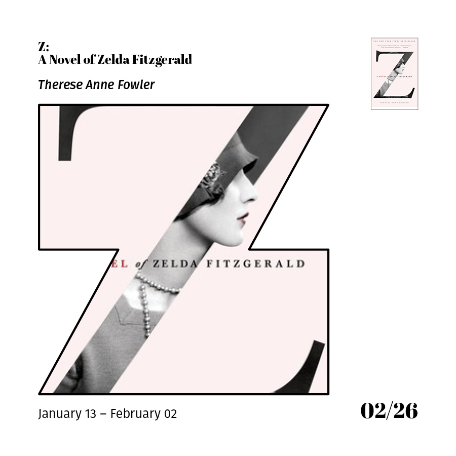
  • Favorite Book Cover: The Girls by Emma Cline (or) Z: A Novel of Zelda Fitzgerald by Therese Anne Fowler
  • First Book Read: Room by Emma Donoghue
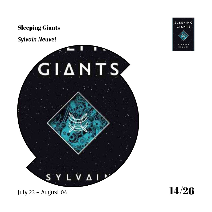
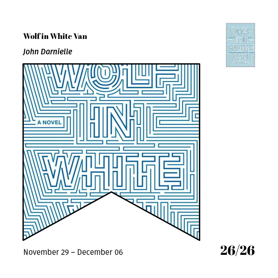
  • Last Book Read: Wolf in White Van by John Darnielle
  • Books read on Audible.com: 2
  • Books read on Kindle: 4
  • Books borrowed from the library: 18
  • Book most outside of my comfort zone / from a genre I don't usually read: Sleeping Giants by Sylvain Neuvel (Science Fiction / Fantasy)

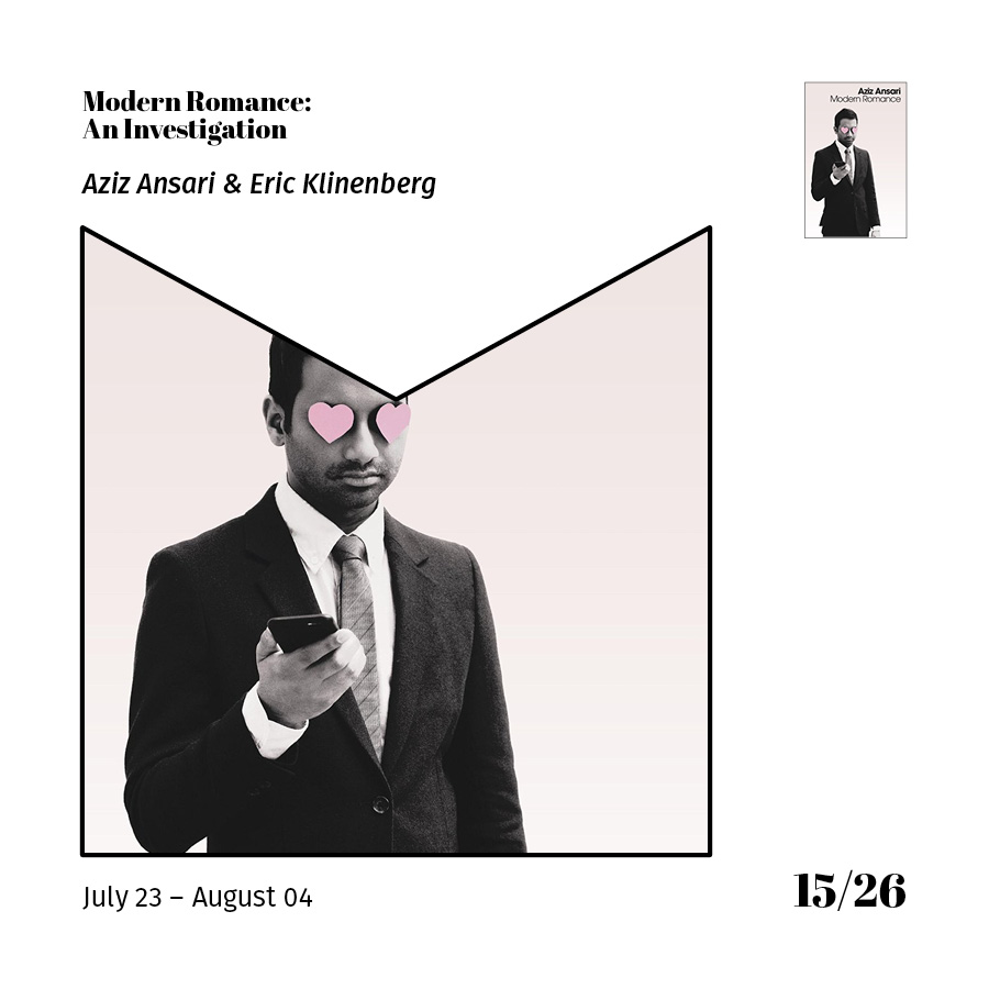
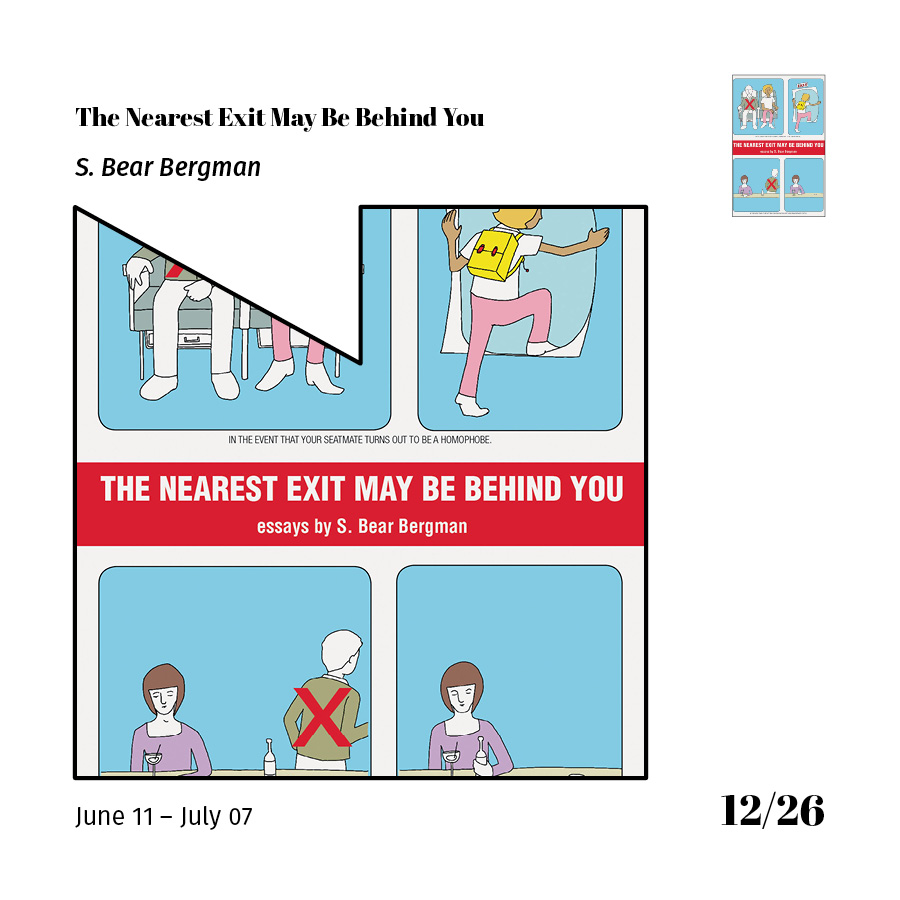
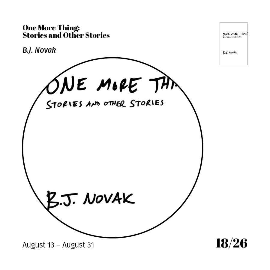
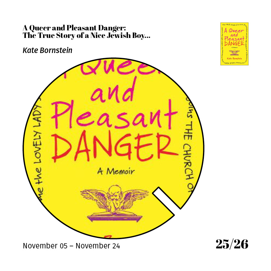
Below, take a look at a more detailed slideshow of the books/process. 

Onto 2017 - I'm not setting any rules for my reading, aside from to keep reading books that excite me and from a diverse pool of tremendously talented authors.

Herbie Hickmott
Designer Spotlight

I forget exactly how I first came across Mike McQuade's work, but I was instantly drawn to it. I love his frenetic collage/compositions and the way the finished pieces end up looking both chaotic and resolved. Most of his work is editorial and must function within a layout in print or on the web. Mike's use of structure, composition, and detail make his pieces really stand out and act as phenomenal companions to the written piece. 


Saul Bass

Saul Bass produced an incredible amount if truly timeless design. From his huge repertoire of logos (so simple and iconic) to his famous work with the film industry (credit sequences, poster design, etc.) His expressive illustration style - geometric and awkward and "off" - is so iconic and it speaks so much to the design around the world at that time. Bass' typography is modern and helps to truly create a "mood" for each poster. Many designers have interpreted Bass' work over the year - and his influenced is still seen every day. I'm a huge fan of Saul Bass' work and still think fondly of the paper I wrote on him for my history of Graphic Design course during my time as a student. 

Herbie Hickmott
Destination: Philadelphia

Overall, I think the Visit Philadelphia site does a great job of presenting pertinent and exciting information to potential visitors to Philadelphia. The carousel of images on the homepage immediately familiarize the visitor with some well-known Philly landmarks (Liberty Bell, the Zoo, etc.) The overall design of the site is clean, pretty user-friendly, and simple, but exciting.

On some of the subsequent pages, the content has clear hierarchy and is reinforced through type size and placement. One of my favorite elements on the site is the semi-branded neighborhood pages. Each neighborhood feels special, and presents the feel/vibe of the neighborhood to a potential first-time visitor, through photographs, maps, and the mini badges/logos that place the neighborhood on the map.

Herbie Hickmott
Best of 2016

Best of 2016

Album Art
It's no surprise that Bon Iver's 22, A Million is appearing in this collection... It's probably my favorite record of the year and the album artwork and promotional graphics are intricate and offbeat. I'm drawn to the severe color palette and the intricate (and weird) illustrations/doodles that designer Eric Timothy Carlson created in partnership with Bon Iver. 

Book Covers
Year after year, I am still most excited to dig through some of the year's best book covers. Here are three that I think represent innovative, exciting, and well-thought out work. I think I am most drawn to the typography in the Version Control cover, hinting at it's science-fiction plot. The background illustration is vague and perfectly obscured.

Movie Posters
Not only is Moonlight my favorite movie of the year, but the movie poster is just as evocative, moving, and beautiful as the movie. The three actors who play Chiron during three distinct periods in his life. The poster breaks and re-configures Chiron's face to reflect his growth through his childhood, adolescence and adulthood. Plus – the coloring and lighting is moody and beautiful, just like the entire film. 

Herbie Hickmott
Grid Magazine Illustration

I have been toying with the idea of pushing myself and trying some editorial illustration. After getting in touch with a friend who works at the good & great Grid Magazine, I decided to submit a packet of illustration samples and figured "what's the worst thing that could happen?"

While I was still processing the recent election results, I was delighted to find an email in my inbox from Grid, asking if I was interested in creating an illustration for an article. I read through the article, in which the author processes how to keep the momentum and drive going from the election, after Hillary Rodham Clinton's loss. The author chooses to focus on  finding causes and opportunities at a local level to support and that she could get involved with.

I was excited to have this opportunity, and to feel like I was helping in some way - to feel like I could do something as small as provide an illustration to help the community at large process the election results. 

The very first thing I sketched was a cropped view of the campaign office mentioned in the article. I kept sketching and pushing myself to come up with more inventive and abstract solutions for the illustration. 

First thumbnail sketch

First thumbnail sketch

After presenting three concepts to the designer I was in touch with at Grid, we pursued this option. After rendering it in Illustrator, trying to capture the defeated, empty, and left-behind campaign office, and adding in some finishing touches, I was so thrilled to see it finally in print:

Final illustration, in print

Final illustration

Final illustration

Herbie Hickmott
Morris Arboretum, November 2016

Spent a few hours walking and rambling around the incredibly beautiful grounds of Morris Arboretum on a bright sunny Saturday. It was a true feast for the eyes, as the foliage was at it's peak and most colorful. The parking lot was packed, but somehow the grounds felt incredibly sparse and personal.

IMG_6503.jpg
Possibly one of my favorite photographs i've taken.

I think my favorite part of the entire trip was the Fernery, which was both lush with life and startling in it's emptiness. 

I cannot recommend disconnecting and finding some solitude in the expansive 175 acres of the arboretum enough. Go out and enjoy!

Herbie Hickmott
From the Archives, vol. 2: Monoweight Sketch

I was looking through some old files...

I have this tiny 3"x5" sketchbook that I have filled pages and pages with sketches like this. I finally decided to take one of those sketches and translate it into a surreal monoweight fever dream of an iillustration. It's not a 100% duplicate of my original sketch, but it's a fun take on the mindless/mindful sketching I sometimes do.


Original sketch - June 2014

Herbie Hickmott
Utility

A Wednesday night doodle...

Random images shot on my iPhone over the last year + some custom type I accidentally started playing with today in the corner of some work notes. 

Random images shot on my iPhone over the last year + some custom type I accidentally started playing with today in the corner of some work notes. 

Herbie Hickmott
From the Archives, vol. 1: Birds

I was looking through some old files...

And found this. It wasn't created for anything specific - more an exploration of style/execution for myself than anything else. I wanted to include color variations (solid, subtle gradients, stroke, etc.)

Part of what I really enjoy about how this came out is also the composition of the page. It almost feels like a production/registration sheet - too formal to be a quick Illustrator doodle.

Herbie Hickmott
A Wolf in Tile's Clothing

You sometimes find inspiration in the most random places, right? I came across a chip/crack in the linoleum tile flooring in my apartment building. I would walk past it a few times a day, on my way in and out of the building, to take the trash out, or to get the Thai food I ordered for dinner. I always found myself going "Oh look, a wolf!" as I would walk past it - finding it impossible to un-see the animal shape within. 

So, I decided to do a fun little illustration of a wolf/fox/animal – using the negative space of the tile as my inspiration and guideline. I tried to use geometric and minimal lines to create the shapes that would form the animal. Subtle and interesting gradients add a light, but graphic touch, which I think brings the whole thing together.

See the process below:

Herbie Hickmott
NYC Gifathon

This Animator Made 30 Excellent GIFs Celebrating His 30 Days in New York City - James Curran

There's so much to love here. The illustration style. The humor. The color palettes. The sound/music. The cataloging of one's every day life. It all comes together to be one (er...30) hugely entertaining GIFs that have so much life, style, and humor in them, it's hard to believe they are just a few seconds.

Some of my favorite GIFs include: 4 - Jeans // 13 - Guggenheim Donuts // 16 - Subway // 17 - Park // 22 - Pancakes // 27 - Black Friday.

More of Jim's work here. 

Herbie Hickmott
Books in Covers 2015

Total: 34

These are the books I read in 2015. Over the last few years, I have made a more concerted effort to read books by different types of people (different backgrounds, styles, races, identities, etc.) This choice led me to some really phenomenal writing from voices I would have missed out on.

I always enjoy seeing the covers of the books I read at the end of the year - it's like a scrapbook/Instagram feed of how my year turned out.

Quick thoughts:

  • Favorite books: "Yes Chef" / "Fun Home" / "Wild" / "H Is For Hawk" / "Why Not Me?" / "Fates and Furies" / "All The Light We Cannot See"
  • Favorite covers: "Yes Chef" / "In The Country" / "Furiously Happy" / "Fates and Furies"
  • Amazing books with underwhelming covers: "All The Light We Cannot See"
  • # of books read in print: 30
  • # of books borrowed from the wonderful Free Library of Philadelphia: 18
  • # of books by a heterosexual white American male: 1
  • # of books by anyone other than a heterosexual white American male: 33
Herbie Hickmott
Best of 2015

Album Covers
Bjork "Vulnicura" ;; Father John Misty "I Love You Honeybear" ;; Future "DS2"

Book Covers
"One Day in the Life of the English Language: A Microcosmic Usage Handbook" by Frank L. Cioffi ;; "Drinking in America: Our Secret History" by Susan Cheever ;; "The Musical Brain: And Other Stories" by César Aira

Movie Posters
"It Follows" ;; "The Revenant" ;; "The Witch"

First impressions are incredibly important when it comes to visual design, but with the sheer amount of consumable media that is released each year, it can be hard to remember your favorites from month to month.

With the album covers, I chose three examples that captured and held my attention. Bjork always has tremendously compelling album covers, and her frequent collaborators M/M and Inez and Vinoodh. I love the arresting image and the super interesting color palette.

What I like best about these three book covers in particular is their unique takes on cover design. Ranging from more traditional to experimental, each cover has excellent composition, typography, and overall design. I especially love "The Musical Brain" cover, and it's use of simple, but classic typography and illustration.

To be honest, as of writing this blog post, I have not seen any of the three movies I chose to feature the poster for. Each poster represents a different approach to poster design. "It Follows" goes retro and alludes to it's old-school horror roots with illustration and expressive typography. "The Revenant" is the most contemporary and 2015-looking of the bunch - with it's dynamic composition, restrained typography, and nearly monotoned palette. "The Witch" is probably the most 'conventional' in it's overall aesthetic, but I really enjoy the choices made from top to bottom. It's mysterious, dark, intriguing, and best of all, leaves me interested in the film itself.

Herbie Hickmott
Spotlight: Parc d’Atencions

(from Brand New)

Parc d’Atencions is a new children’s daytime oncology and hematology center at Vall d’Hebron University Hospital in Barcelona, one of the largest hospitals in Spain. It’s a project created by the Fundación Small and materialized by donations from different institutions, companies and individuals.

What I love about this (beyond the cause/location & strong need for calming/refined space for Children's healthcare) is the sense of imagination, creativity, and design. It's fun without being over-the-top, which is a welcome change to many spaces for Children's healthcare. Often, both sides of the spectrum can be found: intense, cartoon-based, bright, branded spaces (ie. Spongebob decals on the wall) all the way to bland, beige, uninspired. 

I love the illustration style, and the exploration of developing the custom type/letter lockups. I think a patient (of any age) would respond to the sense of whimsy and imagination, while still feeling fresh, and in a way, ageless.

To view more photos and read more information, click here.

Herbie Hickmott
I find myself stuck in this geometry

I'm not sure what this is. And that's ok, right?

What started out as a simple half-circle developed into an odd, reflective, geometric butterfly. Or is it an abstracted human face? Either way, I like it. I had a lot of fun taking these crazy overlapping shapes and then dividing them into separate shapes that then could be colored and given new dimension. I tried to stick to a unified color palette, with the dark blue acting as accent and contrast. 

Herbie Hickmott
Explorations in Monoweight Geometry

I think i've always been drawn to monoweight illustrations - especially if there is geometry, symmetry, and pattern involved.

Recently, I started doing some quick on-screen sketches to just see what I could develop. Often, the hardest things are the simplest things. These aren't 100% perfect, but I'm happy with how they look (both individually, and as a set.)

I wanted each composition/shape to evoke a certain feeling that is different than the other two. I can't specifically figure out which each one is (yet), but I think they are separate enough to be individual, but relatively similar to appear cohesive.

Herbie Hickmott
30 Minute Design Challenge: Element Icons

I recently participated in a fast-paced problem solving design "game" as part of Design Philadelphia, which inspired me to not dwell on perfection, but rather to make quick, impulsive, imperfect choices. Today, I sketched (by accident, really) these little goofy thumbnail doodles. They started out as nothing more than 2 second line explorations.

After I saw the set of 4, I saw the weird potential in the sketches and decided to push them further. I set a 30 minute timer for myself, and started working. Utilizing my initial sketches as the basis, I developed a set of 4 icons/illustrations representing the 4 elements. I wanted to keep the expressive and organic shape of the original sketches, and developed a 3 or 4 color palette for each icon. 

The results aren't perfect, and that's ok. The creative rush of working towards a goal in such a tight time frame led me to make choices I might not normally make (for better or worse.) 

Herbie Hickmott